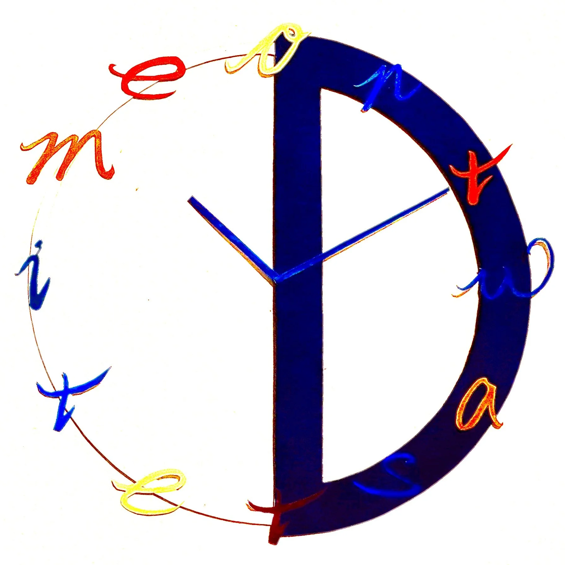
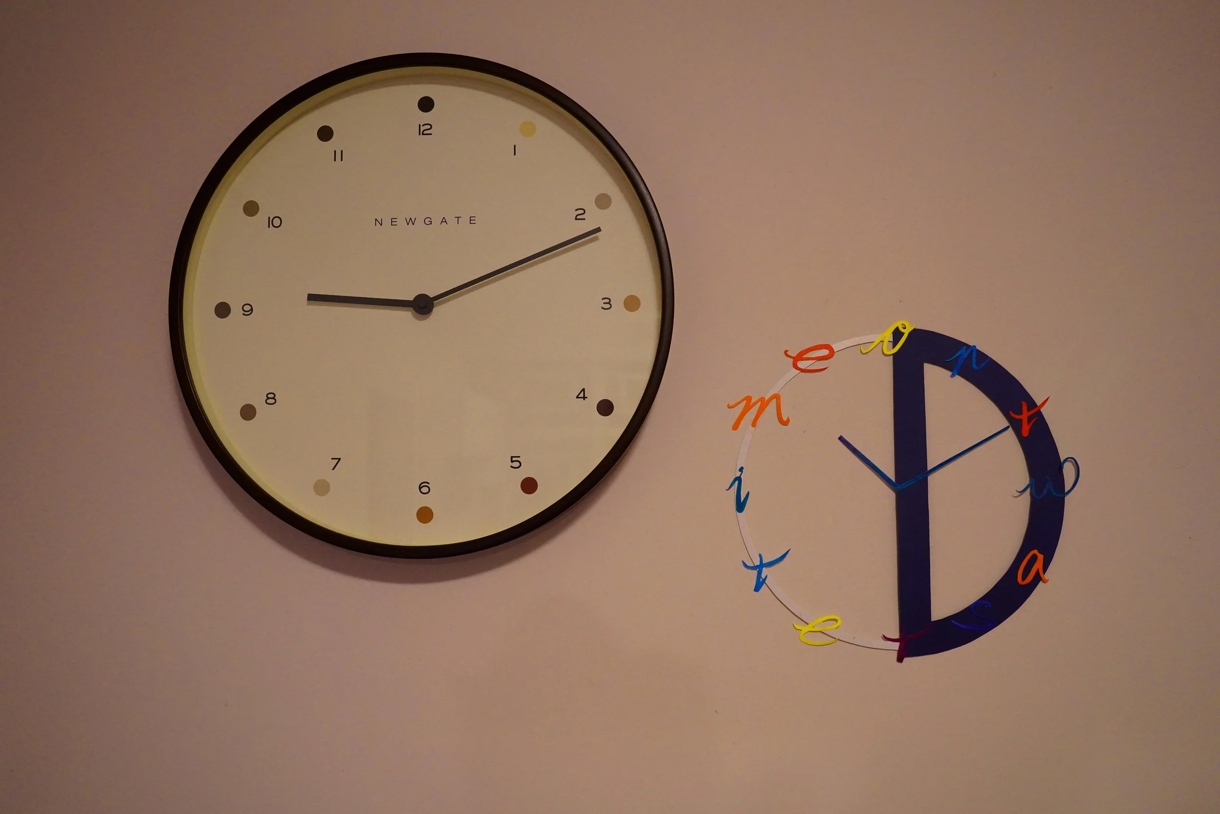
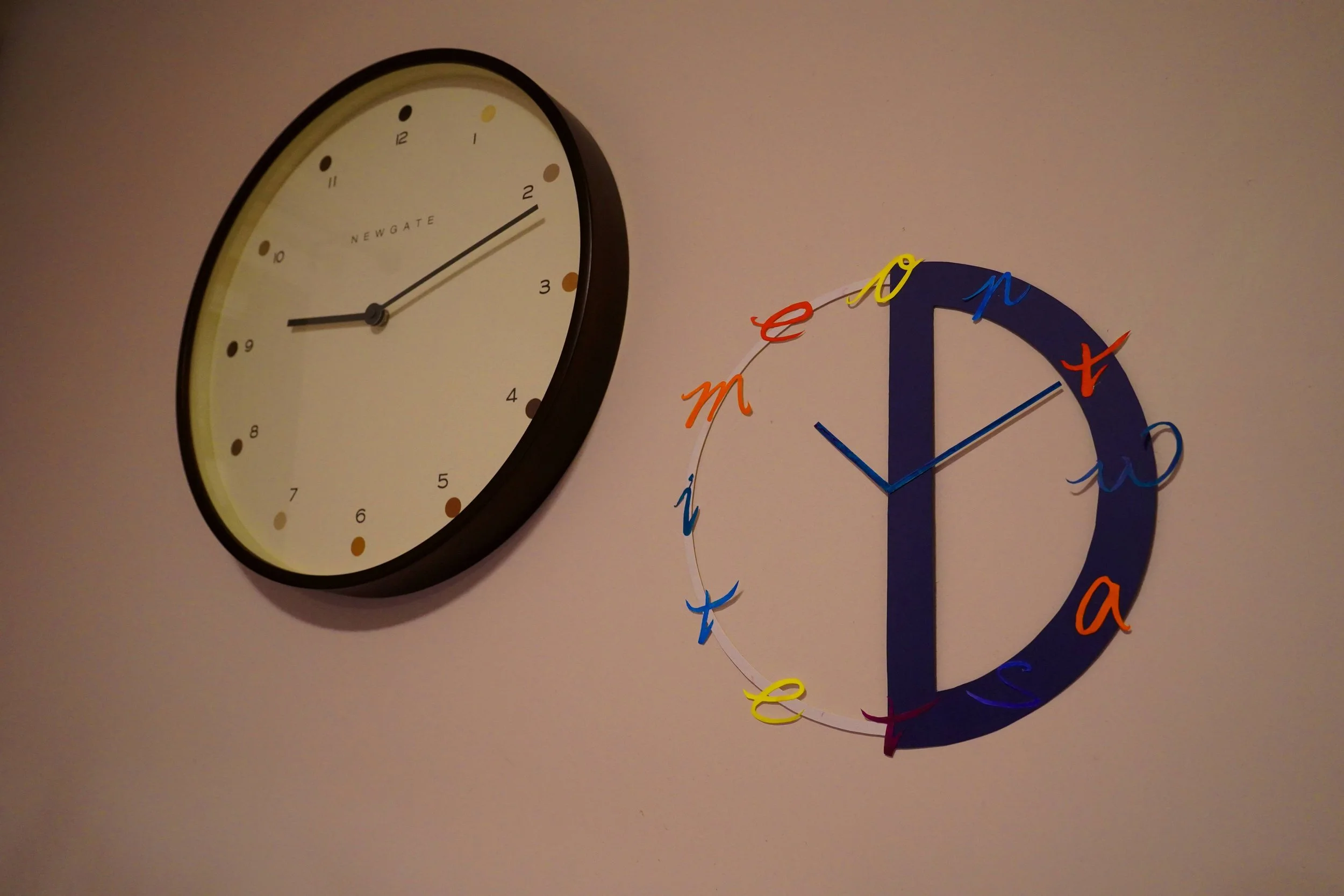
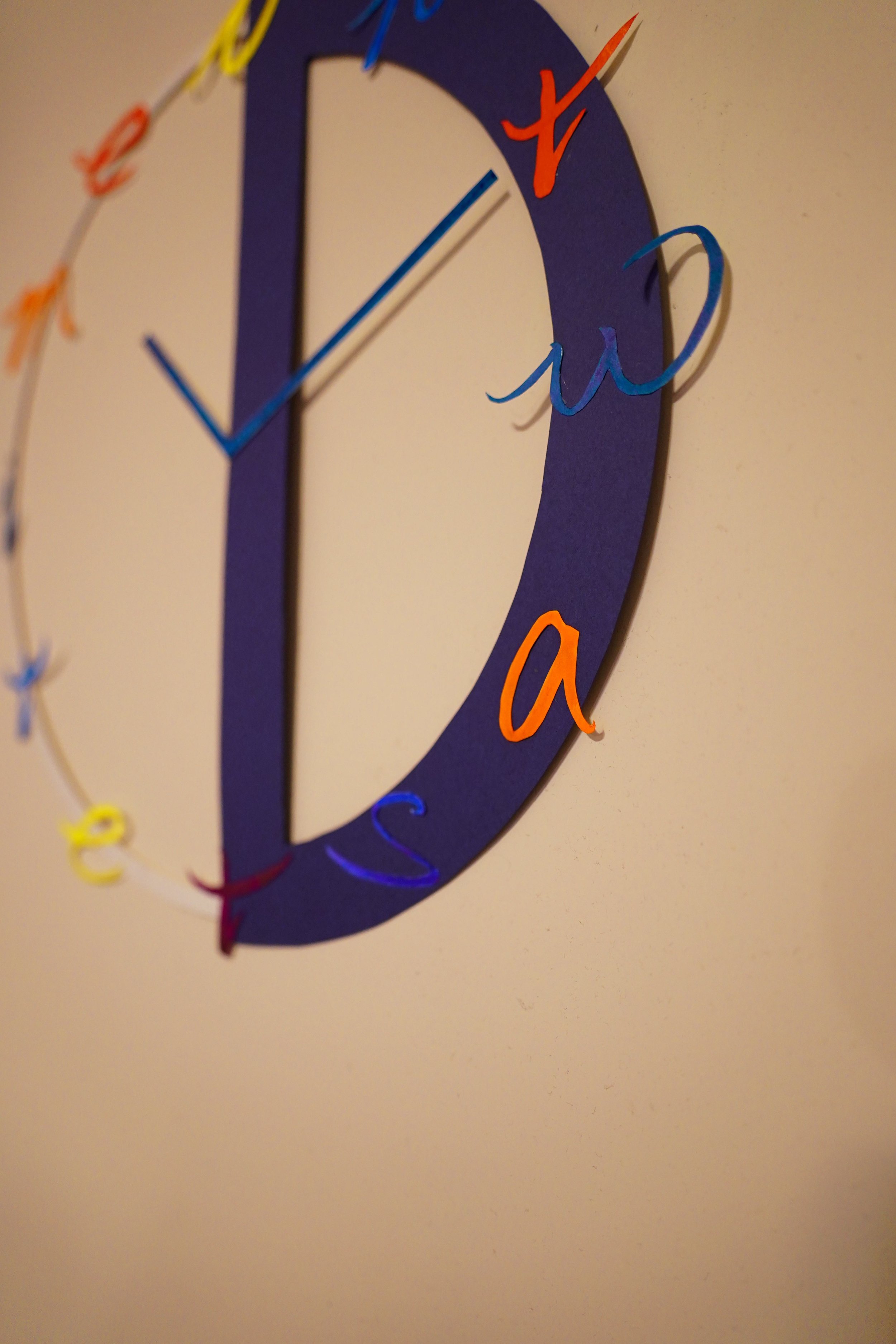
Don’t Waste Time
Concept
This is a project based on the concept of type as image. Initially, I chose to use a single word and add effects on it just to amplify the meaning. But I wanted to have fun so I want to make something that looks like a readymade object. So I turned to think of something that I heard of all the time, and the phrase “Don’t Waste Time” appeared in my mind.
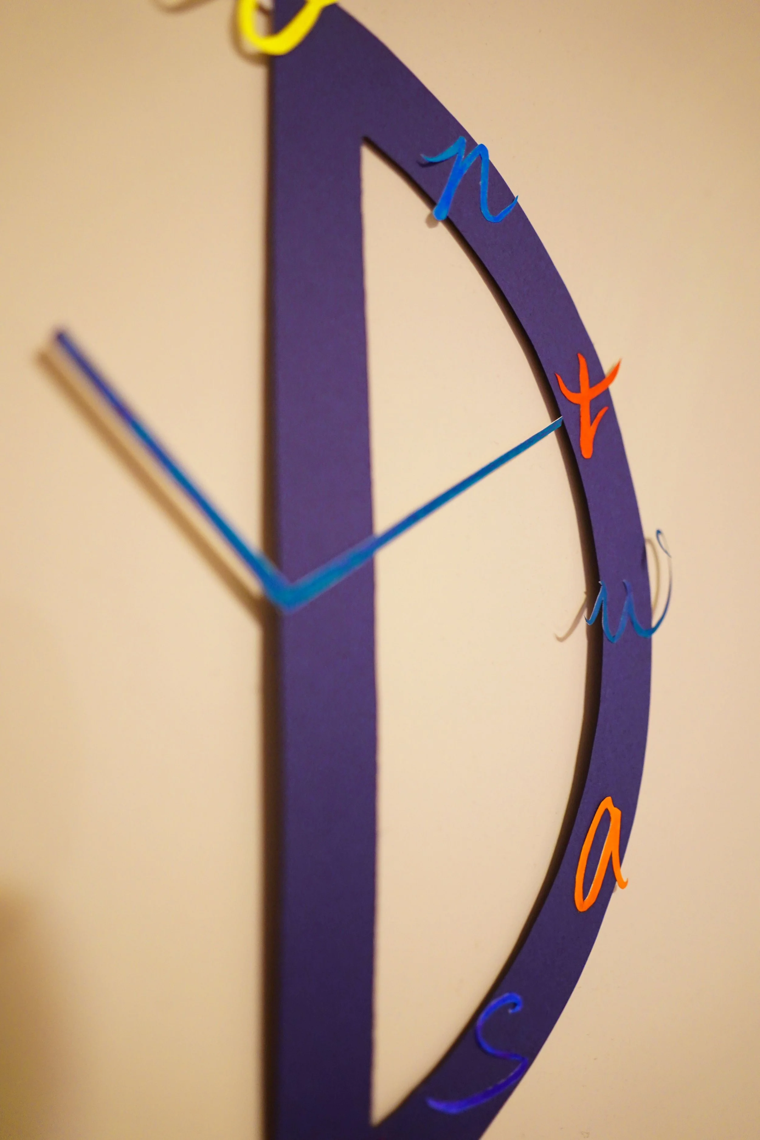
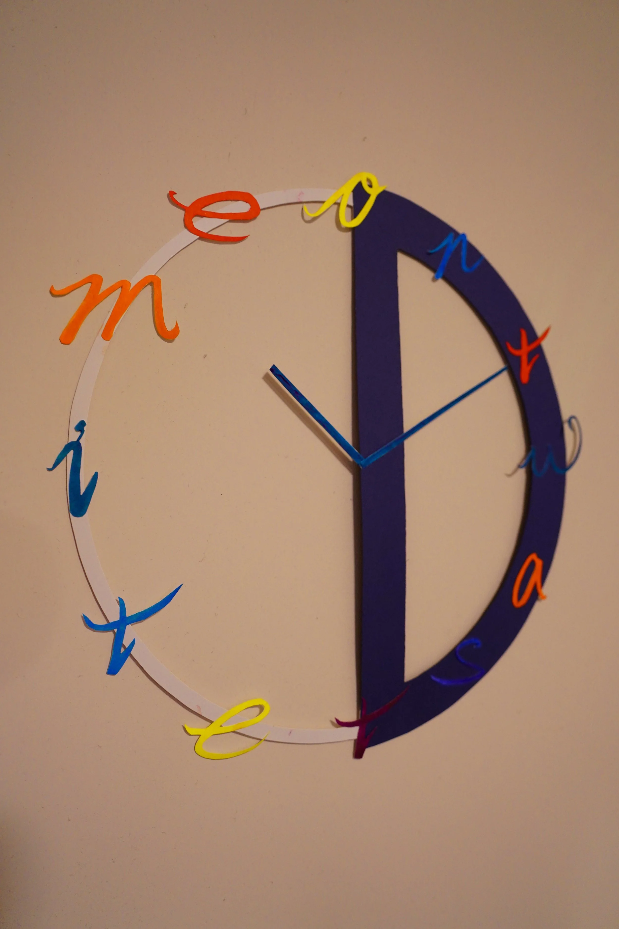
And when I thought of the objects that are related to time, I thought clock is the closest and easiest object to made. The simplest way is to just put the phrase right on the clock but it seems too simple, so I broke the phrase and use all of the alphabets to form the clock. Yet there are 13 alphabets in total so I took the first alphabet D that looks like a half circle to be the base frame of the clock and put the other alphabets on the D so as to form the clock.
Details
How I made it
All of the letters are hand drawn by hand on paper, hand cut and paint by water colour. The big “D” is a thick blue coloured paper, also cut by hand as the base support of the letters and form the clock. Placing the hour hand and minute hand in this position is because 10:10 is considered the best position for displaying the clock so I use the same placement to make it look like it is a real clock display.