Text Based Artworks
At a glance.
Story behind.
At a glance.
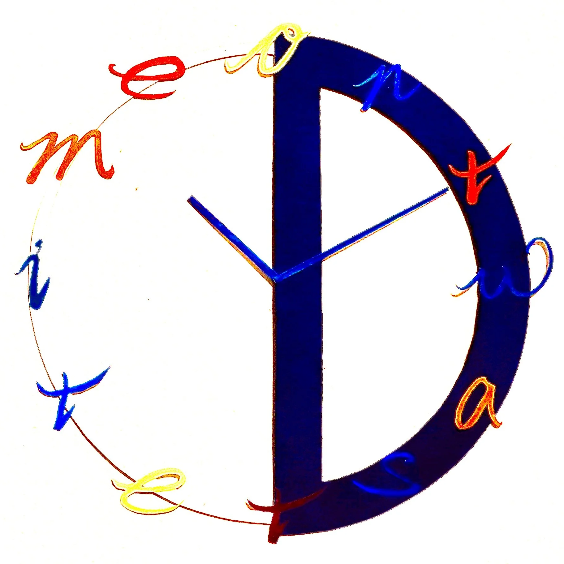
A clock face design formed by “Don’t Waste Time”.
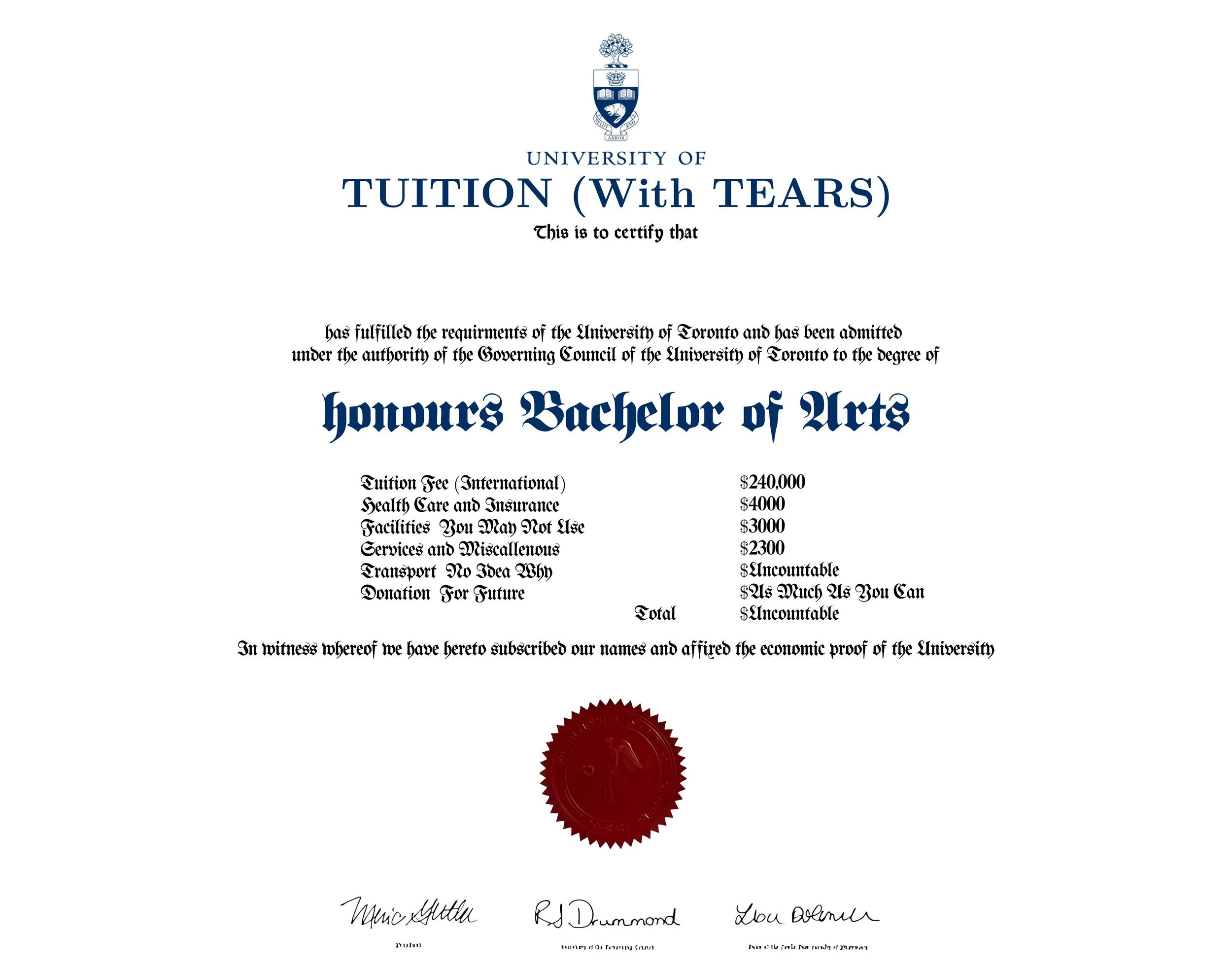
A receipt like diploma for UofT.
Made when frustrated by TTC by its nonsense. Toronto experience.
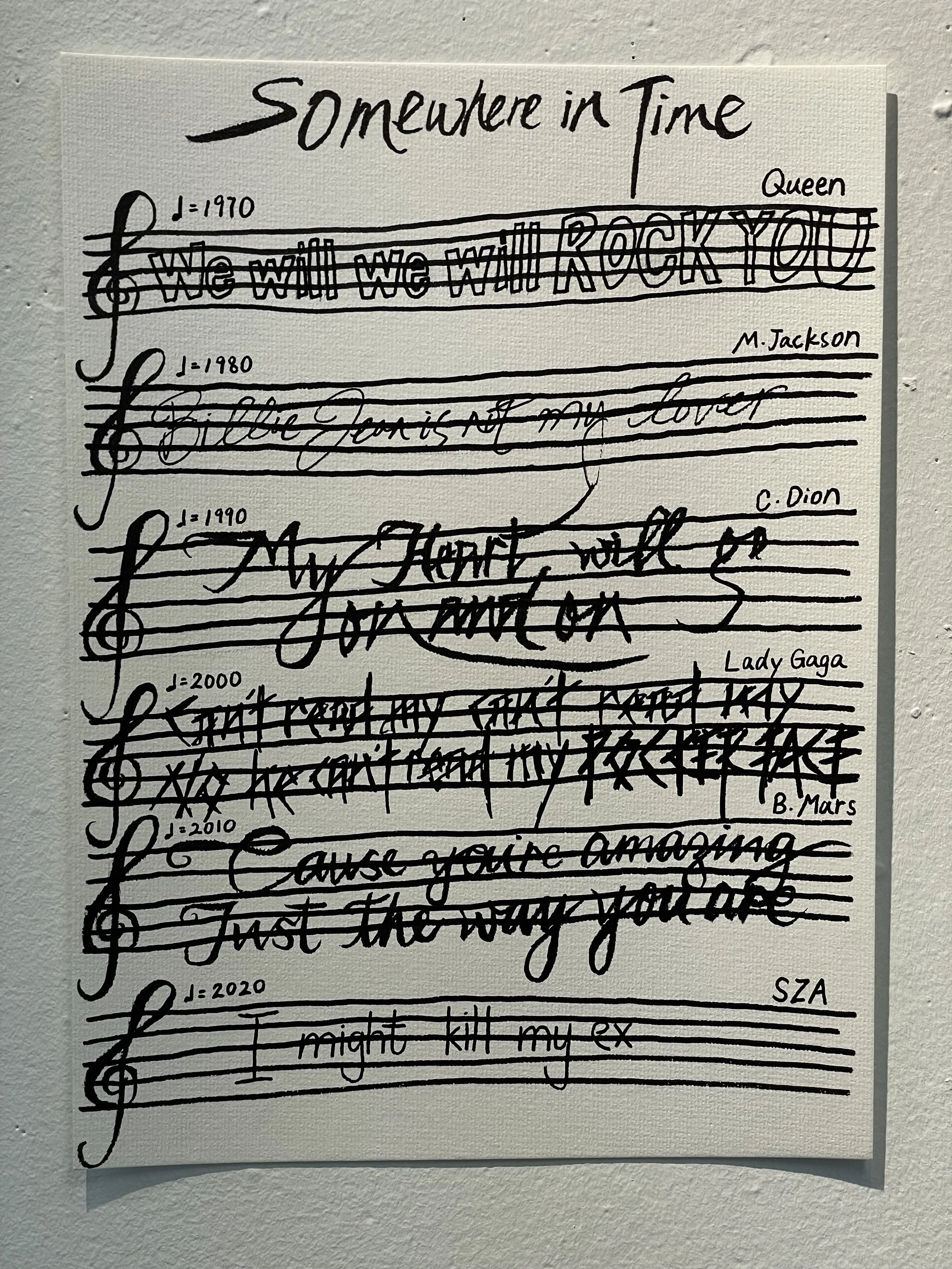
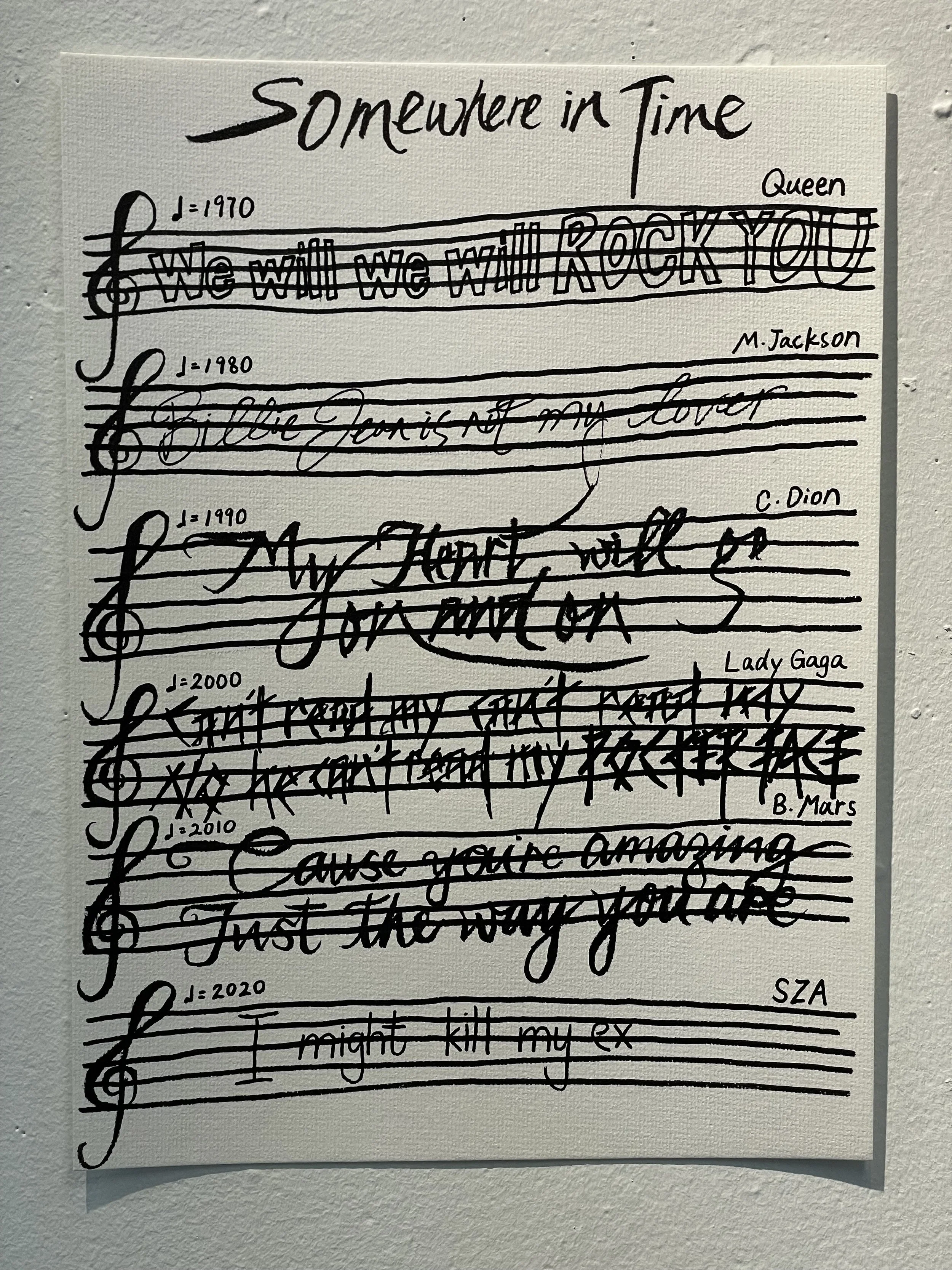
Bring you back to the past by iconic lyrics and font of the time.
Story behind.
Text based work in my preference is mainly for conveying a strong, singular, clear message but in a fun way.
These are the work that mainly use text to create, mainly the concept of text as image.
I mock the original design for some of my work. I altered the meaning to be something completely different or even opposite to the original one for irony and fun. But not bad intention I must make it clear.
The layout of how to line up the texts is one of the main technique that define how to use text as image.
The work usually has to be designed for putting in a specific context to maximise the message. And the template design that match the context for exhibiting would also help to emphasise the message.
The palette choice for the work would be setting the theme and tone for the work. So some of them I used more colours. Some of them as I took the template to modify it and to make it look like the authentic original, I follow the colours of the original template.