Lights and Palette
Concept
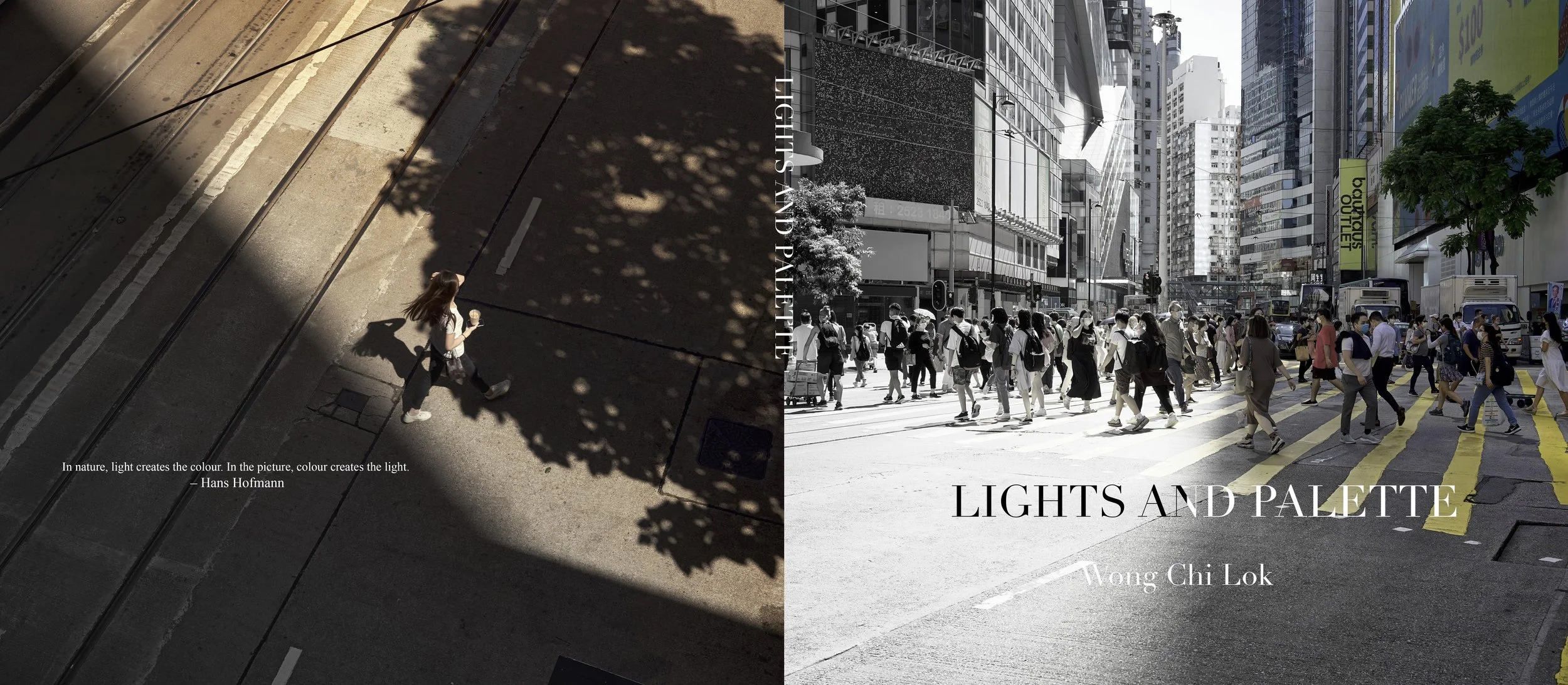
Lights and Palette is a photo book that I finished in 2024. It has 2 parts in the book, one part is a comparison between coloured photo and black and white photo. The other half is coloured photo and tinted coloured photo.
The first half I want to explore the importance of colours in photo. As taking a photo means capturing the light and the light that is reflected by the object. And surprisingly when some of the photos are converted to black and white, some of the key elements in the photo would be less important or even disappeared by edit. For example, some colours in the rainbow would be largely disappeared. It shows how colour would decide the main object in a picture.
And in the second half it is because I have colour weakness problem which I would mess up some of the colours when they looked similar to each other. Like yellow and green, blue and purple, orange and yellow. I chose to tint the colour of a photo to the other colour which is very similar to the original tone in my point of view, to let the readers know what colours made me feel similar yet for them it might be very different.
Now available to borrow in University of Toronto Scarborough Library.
How I made it
The most important and time consuming process is picking photos. As it has to suits the theme and title of the book. Resizing and edits to make the difference more obvious is also a vital factor of the project.