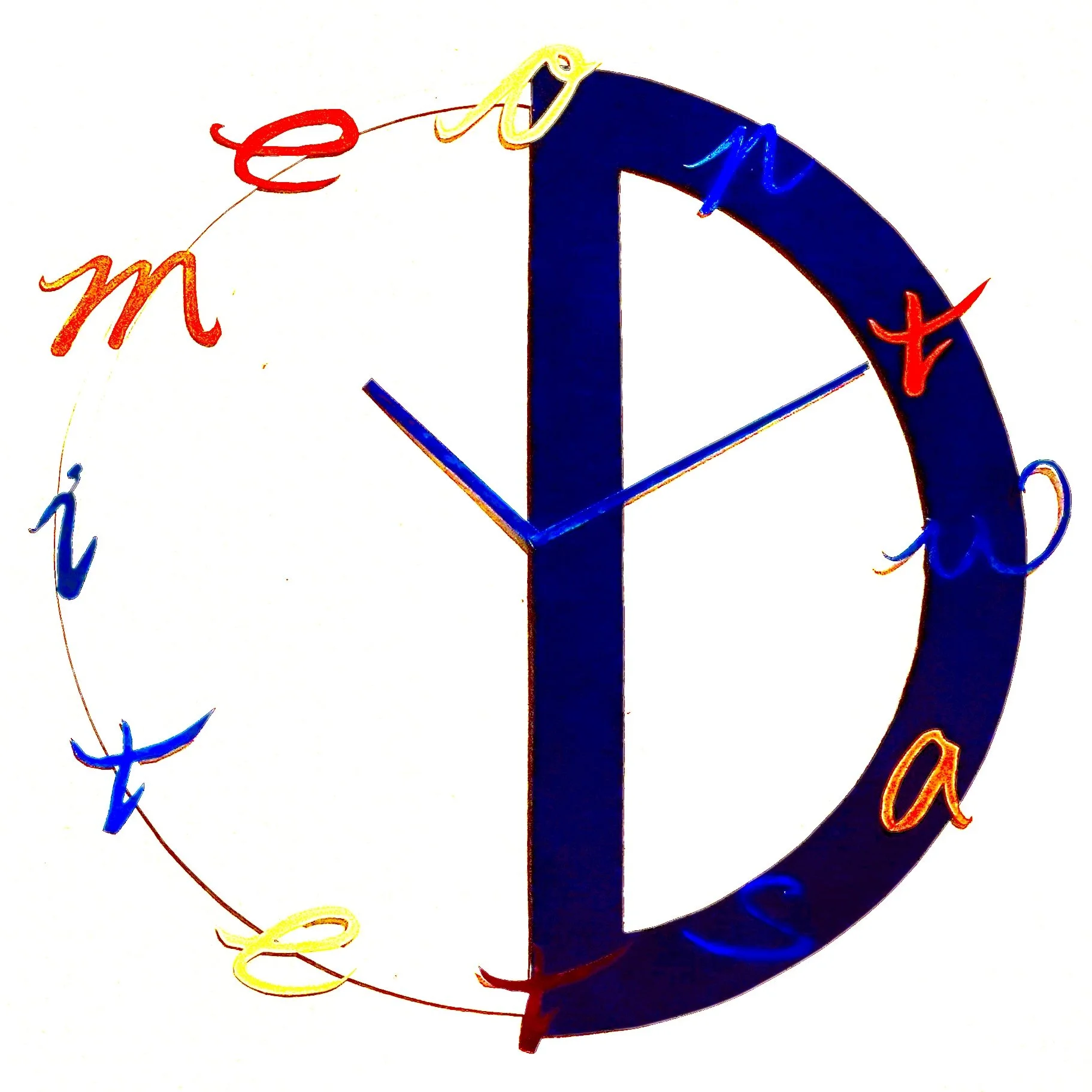
Don’t Waste Time
Concept
This is a project based on the concept of type as image. The alphabets from the phrase “Don’t Waste Time” are used to build the clock as the phrase is . Using different colours adding the fun and playfulness to the most quoted sentence by teacher and mom for scolding children.
Execution
All of the letters are hand drawn by hand on paper, hand cut and paint by water colour. The big “D” is a thick blue coloured paper, also cut by hand as the base support of the letters and form the clock. Placing the hour hand and minute hand in this position is because 10:10 is considered the best position for displaying the clock so I use the same placement to make it look like it is a real clock display.